

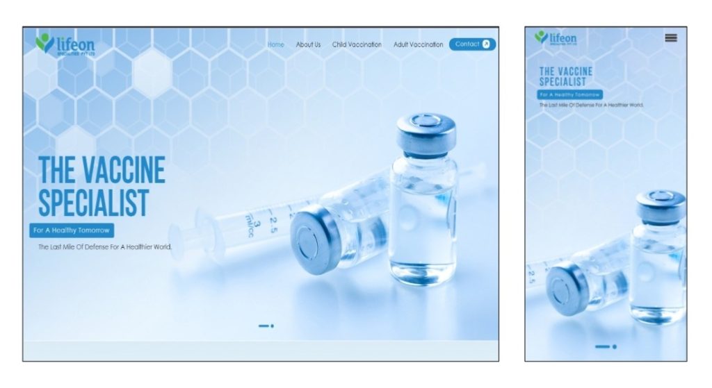
Responsive web design means your website automatically adjusts to different screen sizes such as mobile phones, tablets, and desktops.
A responsive website improves user experience because visitors can easily read content, navigate menus, and interact with your website without zooming or scrolling sideways.
Google also prioritizes mobile-friendly websites in search rankings. This means responsive design not only improves usability but also helps with SEO performance.
Another major benefit is consistency. Your website maintains the same professional appearance across all devices, which helps build trust with users.
In today’s mobile-first world, responsive design is essential for every business website.